Responsive vs. Scalable Email Design
Email design can be very different from normal web design. Since every email client (i.e Outlook, Gmail, Apple Mail) you would come across is extremely different and do not have the same HTML standards as each other, unlike web browsers, it can be quite complex to design an email template to suit all clients across the board.
It is quite common to come across broken email layouts, especially when not reading emails on a web browser. Even worse though, is reading your emails on an internet-enabled mobile device with small fonts and narrow columns being common issues.
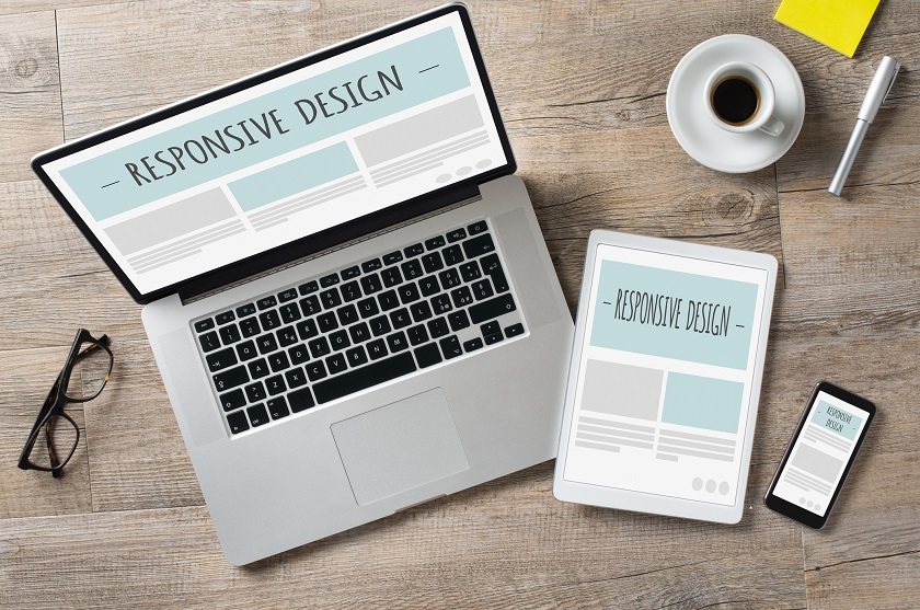
Responsive design used on emails would have been a great solution, if not for only 60% of mail user agents supporting it. So unless you only cared about the main agents, such as Apple Mail, it would be recommended to try a different path. Scalable email design follows much of the same direction as responsive but without the complexity. It fits in with all of the email clients, plus “scales” easily down to size, making it readable for mobile/ tablet users.