Why a Responsive Website is a Must
Over the past couple of years, the use of desktop PCs and even laptops has dropped drastically. More and more people now use tablets and smartphones. According to MagnaGlobal’s report “Unlocking the Power of Mobile”, 76 percent of Australians access the Internet on mobile devices – smartphones and tablets. In the same report, 57 percent of respondents stated that they expect websites to be tailor-made for mobile devices.
The global mobile-internet-usage is expected to overtake desktop-internet-usage by the end of 2014. This brings us to the point we would like to address today – responsive web design is the key to success in 2014. If you are wondering what a responsive website design is, do not worry, most online businesses haven’t figured it out yet.
What is a responsive website?
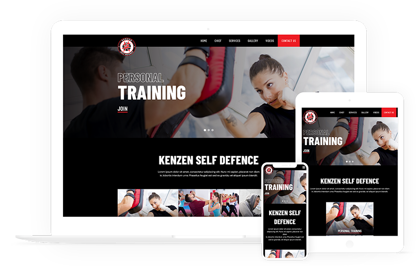
A website that seamlessly adapts itself to whichever device (desktop, smartphone or tablet) it’s being viewed on, is called a responsive website. Irrespective of the device your customers choose to access your website through, it should appear and function without any hiccups.
All of us have experienced non-responsive websites on our mobile devices. You need to zoom, scroll left and right, readjust size of the font, and more to use the website. Having such a website, that causes inconvenience for your customers, is extremely bad for your business.
If you use a tool like Google Analytics, you can check the percentage of visitors on your website via desktops or mobile devices. We believe the percentage of the latter will be close to 50 percent.
Google to penalize non-responsive websites
Mid-2013 Google announced that it would start penalizing websites that aren’t mobile-friendly. On Google’s official blog, Yoshikiyo Kato, software engineer with the Mobile Search team stated that the number of people using Smartphones is increasing at a fast rate. He added that Google wants these users to get the best experience while using the Internet.
So, if you are looking for better SEO for your business it is high time your website incorporates fluid, responsive web design.
A responsive website utilizes the same URL and HTML code irrespective of the device, and that makes Google’s job of crawling, indexing and organizing content a lot easier. Also, one website/URL translates into ease of sharing content, interacting and linking.
Consistent user-experience
You will agree that the quality of user-experience is a top priority for your online business. User-experience is directly correlated to the chances of the customer returning to the site and converting the visits into business. A uniform experience across all devices is critical in this regard. This is why responsive web design is so important.
On a personal level
A responsive website is good not just from the perspective of customers and business, but from the perspective of it being easier to manage as well. Say you are running a marketing or SEO campaign. It is much easier to track it and evaluate its effectiveness on one website, rather than two – a desktop site and a mobile-specific site.
Call us today for a quote on a responsive website for your business before you lose potential customers using mobile phones!